This visualizes the health data and the indicators causing morbidity and mortality in the National, States, and the Local Agencies of the United States.
“Health is created and lived by people within the setting of their everyday life; where they work, learn, play and love”, _ The Ottawa Charter, 1986.
A healthy city is one that is continually creating, improving it’s physical and social environment, and expanding it’s community resources which enables people to mutually support each other in performing all the functions of life and developing to their maximum potential.
Not so long ago, I became passionate about Healthcare and how it can be successfully implemented to help people achieve optimal health status and fulfill human safety goals. The goal is to maximize disease prevention via a “whole system” approach, which integrates litigations across risk factors. Then I was hell-bent on knowing what the risk factors are.
With increased urbanization, a growing proportion of the population would be exposed simultaneously to these risk factors which must have resulted from different causes. The urban environment differs greatly from that in which humans are evolved, with potentially important consequences on health. With this goal, I was intrigued by my country’s health standing and the world at large. This made me explore the World Health Data.
Exploratory Data Analysis (EDA)
Data Source
Health Inventory Data Platform is an open data platform that allows users to access and analyze health data from 26 Cities, it illustrates health status of 26 of the United States’ largest and most urban cities as captured by 34 Health (and six demographic-related) Indicators. These indicators represent some of the leading causes of morbidity and mortality in the United States, and the leading priorities of National, State, and Local Health Agencies.
Public health data were captured in 9 categories: HIV/AIDS, Cancer, Nutrition/ Physical Activity/ Obesity, Food Safety, Infection Diseases, Maternal, and Child Health, Tobacco, Injury/Violence, and Health/ Substance Abuse tagged Big Cities Health Inventory Data by data.world
Data Wrangling and Visualization
The jupyter notebook comes with many helpful packages for Data Sorting, Data Filtration, Data Reduction, Data Access, Data Processing, and the most prominent of them all is Pandas which is built upon the NumPy package. Pandas is versatile across different tasks in Data Analysis ranging from reading files in CSV formats, dropping irrelevant rows and columns, to filling the missing values in their respective columns. The famous Python Library Matplotlib was used to plot Histograms, Barplots, and the rest. The Seaborn was used to create more attractive and informative statistical graphics to give insights into the plot.
You don’t want all these extra explanations? Check the code here on GitHub.
Here is an overview of what the dataset looks like by calling the name of the file;
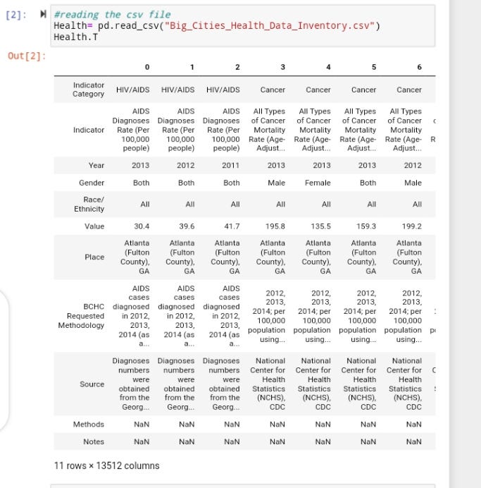
The Dataset contains estimates for Demographic Indicators shared by the Big Cities Health Coalition Members. The estimated values of Demographic Indicators cover the 2010- 2018 period and are described by Location, Sex, Race/ Ethnicity.
Now Let’s go get it by diving into the Data Visualization of each of the data columns.
Indicator Category
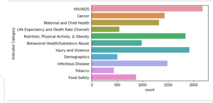
Observation
This shows that a very high number of people had HIV/AIDS, followed by people with Injury and Violence, to Nutrition, Physical Activity & Obesity. The least number of death is found in Tobacco.
Year
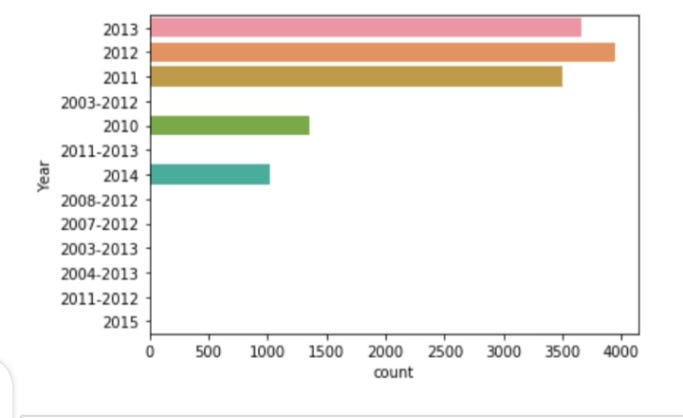
Observation
With respect to the Year column. There’s a high mortality rate in 2012, followed by 2013 and 2011.
Race/ Ethnicity
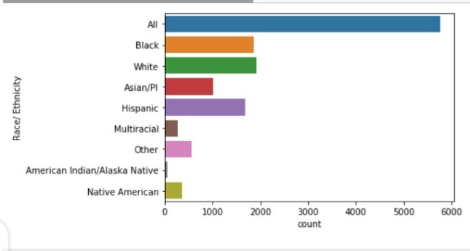
Observation
In descending order of the Race/ Ethnicity column. The distribution goes down from the White to Black, to the Hispanic. Fewer Indicators are seen among the American Indian/ Alaska Native. Having a wider look of this, as of July 2016, White Americans are the racial majority, African Americans are the largest racial minority, comprising an estimated 13% of the population. Hispanic and Latino Americans are the largest ethnic minority comprising an estimated 18% of the population. The white Non-Hispanic or Latino Population make up 60.4% of the nation’s total, with the total White Population ( Including White Hispanic and Latinos) being 77%.

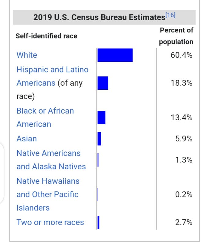
Now, let’s imagine we have a Total Population of the whole of the United States as 10,000. We will most likely estimate the White Americans to be 0.604 while the Black or African American as 0.13 which shows a very big difference between the two. In reference to the visualization of the Race/Ethnicity column, there is a very high mortality rate among Black Americans than White Americans.
Gender
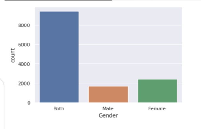
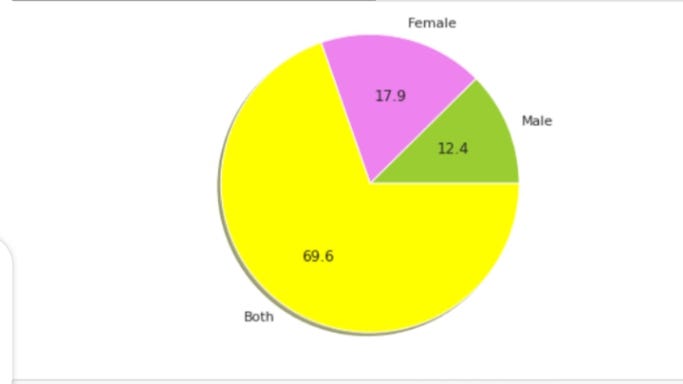
Observation
Based on the Gender column visualization, there’s a 12.4% mortality rate of the Male and 17.9% mortality rate of the Female out of the 30.3% observed. Concurrently, I know we’re both thinking why this is so. The high death of Female to Male must’ve been triggered by something. This is going to lead us to the visualization of the Gender and Indicator Category columns.
Gender and Indicator Category
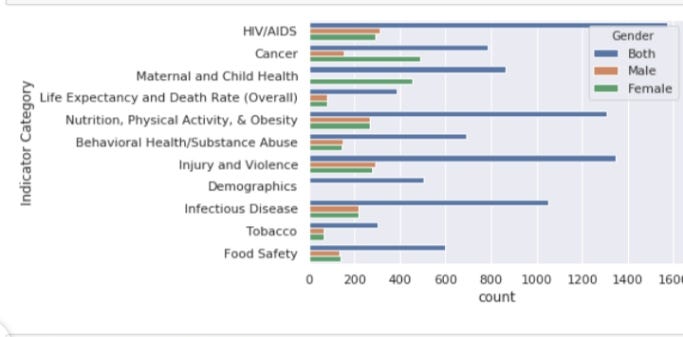
Observation
Variable like Cancer has more Females prone to it than Male. Maternal Health has only Female Values which is quite right. Here comes the reason why there are more Females death than Males.
Place
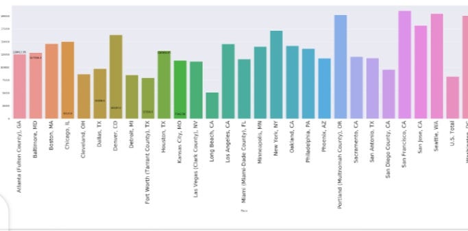
There are many data in the “place” category. However, we will create State features and see the distribution for State variables.
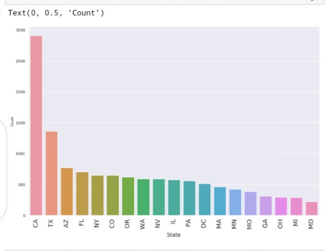
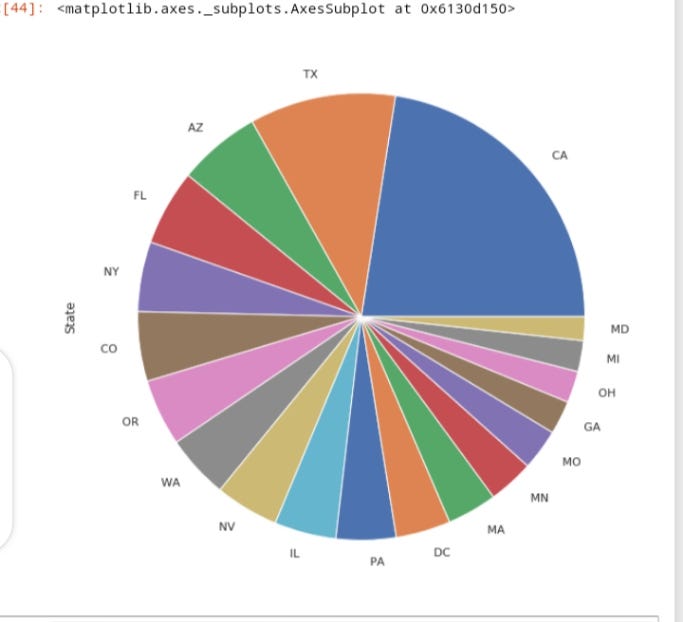
Observation
State distribution shows that the State CA has more deaths, followed by TX, AZ, FL, NY, IL.
Note
CA: California
TX: Texas
AZ: Arizona
FL: Florida
IL: Illinois
CO: Colorado
OR: Oregon
NV: Nevada
NY: New York
MA: Massachusetts
DC: District of Columbia
PA: Pennsylvania
MO: Missouri
GA: Georgia
MI: Michigan
MD: Maryland
State Visualization based on different Indicators
CA has the highest mortality rate to HIV/AIDS, followed by TX, to FL.
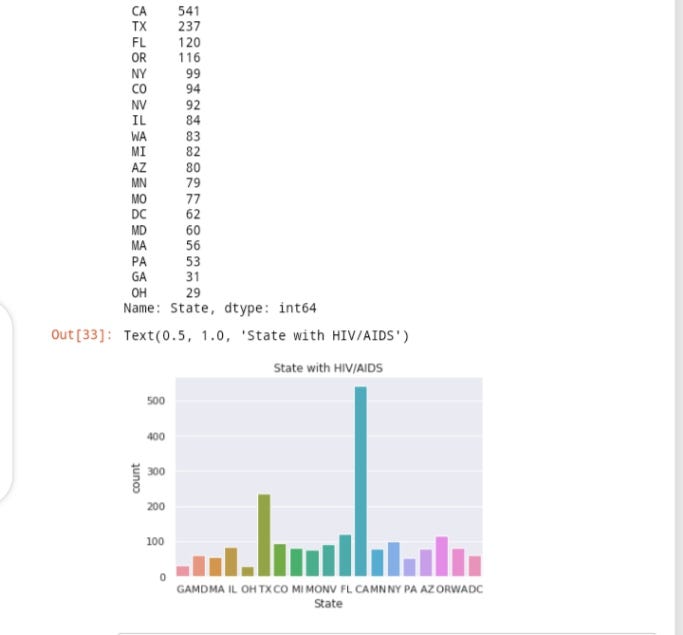
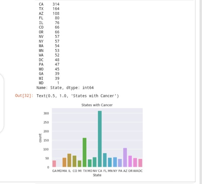
CA has the highest mortality rate for Cancer, followed by TX, to AZ.
CA has the highest mortality rate for Substance Abuse, followed by TX, to PA.
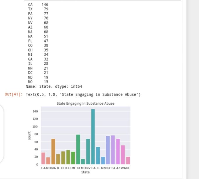
Without much ado, CA is seen to be topping the list in all the Indicator Categories. The reason must’ve been because it’s the most populous state in the United States, with 38,332,521 residents (2013 estimate).
Indicator

Observation.
There’s quite a wide spectrum of indicators that can effectively escalate the mortality rate across the globe like HIV/AIDS, Cancer, Diabetes, Drug Abuse- Related, Female Breast Cancer, Firearm, Heart Disease, Homicide, Lung Cancer, Median Household Income, Motor Vehicle with the highest mortality rate is seen in Median Household Income.
- How does the Household Income cause death? Meaning, there must be causation between this indicator variable and one of the other variables. More so, it must be caused by the “Percentage of people who are Obese” and slightly “Diabetes Mortality Rate”. So I assume it’s this kind of connection, “You have more money, you tend to eat more” which implies that the higher the value of Household Income, the higher the food consumption.
- Opioid-Related Drug Overdose Mortality Rate: In the big cities of the United State. The “Drug Abuse Related Hospitalization rate” is high plus the “Percent of High School Students who currently smoke”. This shows that most adults and teenagers who live in the largest and most urban cities like America smoke more. Many of those high performing jurisdictions have placed evidence-based laws to deter youth smoking to reduce the mortality rate in the world.
- Heart Disease and Cancer Mortality rate: These have been proven to dangerously annihilate quite a number of people. The visualization shows that the mortality rates of Heart Disease and Cancer vary widely across American cities.
- Injury and Violence: Each year, over 1.6 million people worldwide lose their lives to injury and violence. Most especially, violence is among the leading causes of death for people aged 15–44 years worldwide. Accounting for 14% of deaths among males and 7% of deaths among females.
Modeling
After a whole while of visualizing, I had to use Label Encoder on all the categorical variables for easy modeling. This is regression analysis. So, Linear Regression is the best fit for it (Relax, it isn’t that technical as it sounds). I imported Mean Squared Error, Mean Absolute Error, and R Squared from sklearn.metrics to measure the regression accuracy.
Click here for the code.
So here’s a quick summary of all the insights generated from this data;
- Females are decreasing more than males, chiefly due to their higher susceptibility to cancer and maternity complications.
- Black Americans have the highest death ratio in the United States.
- California is the state with the highest number of deaths.
- The most common cause of death in the big cities is HIV/AIDS which kills a lot of people globally.
- The highest mortality rate was found in 2012 across all indicators.
If you find the article insightful, do well to clap and share. You may also connect with me on Twitter and LinkedIn.
